Google Track

Showing posts with label Big. Show all posts

Friday, June 20, 2014

Must read before attending any data science interview

Vincent GranvilleHere is fundamental resources that you should check out before your next data science interview. Read these documents thoroughly to get prepared, impress your interviewer, boost your chances to be hired, and get a bigger paycheck if hired:

Resources to read 2-3 days before your job interview:
Related articles

Thursday, October 31, 2013

Your Data Analysis Takes How Long?

Reference: www.biblogg.no

andycotgreave


Andy Cotgreave, Social Content Manager at Tableau Software, looks at how analytics tools can help to save valuable time

Imagine, for a moment, that you’ve been given a task to analyse a dataset inside sixty minutes and share your results. How far do you think you would get in that time?
It’s a question I had cause to reflect on recently, after running «Fanalytics», a workshop for users of Tableau Public. In the workshop, we gave people a dataset and one hour to do something cool. Their results were astounding.
To understand why they were so impressive, let me provide a little context by considering how many of us work with data.
First, let me dispel a myth. Contrary to popular opinion, if you are using spreadsheets or traditional BI tools, it is quite possible to build beautiful charts. Unfortunately, each view of your data takes considerable time to build, Do you have that time to spare in your working life? What if the chart you take 10 minutes to build doesn’t answer your question? What if it inspires a new question? You have to go back and start again.
What if you could explore your data at the speed of thought instead? What if each mouse click changed the view instantly? This is what we call visual analytics: it allows you to find insight in your data at speeds unimaginable just a few years ago.
You’re probably wondering how all of this relates to the Fanalytics competition I mentioned earlier. Well, during the session, we gave our teams a list of every UK Number one album since 1956, downloaded from Wikipedia. The instructions they were given were to analyse the data and publish something interesting within one hour.
Did they deliver? Oh, boy, yes, and in ways that made my jaw drop. Each entry was different. The winning team analysed albums that had been to number one more than once, revealing perennially popular music, and the effects of sales on a musician’s death. Another team came up with an album explorer that found out which album was number one on your birthday. One team created a visually gorgeous dashboard, sure to engage anyone. A further team came up with a predictive model based around the likelihood of any album title to get to number one. You can see all the entrants on Tableau’s Fanalytics blog post. What was truly amazing was that they did this in one hour. Sixty minutes!
Unfortunately, many people are stuck with tools that are cumbersome or too hard to use. It often takes more than an hour just to connect to data. The simple lesson I’ve learnt from the recent session is that although some tools can make amazing charts, they are often unnecessarily complicated. With some, you need to fill in five steps in a property wizard just to draw a chart. In others, you are required to write custom scripts before you can start drawing anything.
The question we need to ask is whether we are using the right tools to answer questions quickly and in the most efficient way? If not, then perhaps it’s time to ditch these time hogs and focus on analytic tools that save you time instead!

Wednesday, July 17, 2013

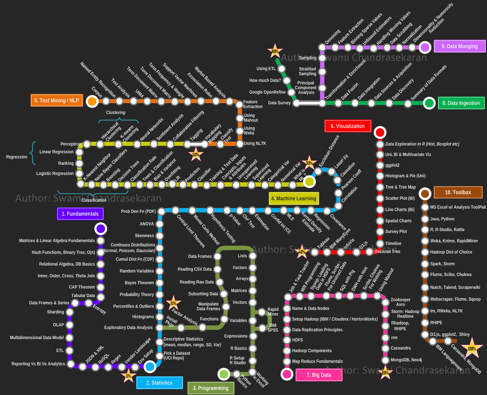
Becoming a Data Scientist – Curriculum via Metromap

by Swami Chandrasekaran

Data Science, Machine Learning, Big Data Analytics, Cognitive Computing .... well all of us have been avalanched with articles, skills demand info graph's and point of views on these topics (yawn!). One thing is for sure; you cannot become a data scientist overnight. Its a journey, for sure a challenging one. But how do you go about becoming one? Where to start? When do you start seeing light at the end of the tunnel? What is the learning roadmap? What tools and techniques do I need to know? How will you know when you have achieved your goal?
Given how critical visualization is for data science, ironically I was not able to find (except for a few), pragmatic and yet visual representation of what it takes to become a data scientist. So here is my modest attempt at creating a curriculum, a learning plan that one can use in this becoming a data scientist journey. I took inspiration from the metro maps and used it to depict the learning path. I organized the overall plan progressively into the following areas / domains,
  1. Fundamentals
  2. Statistics
  3. Programming
  4. Machine Learning
  5. Text Mining / Natural Language Processing
  6. Data Visualization
  7. Big Data
  8. Data Ingestion
  9. Data Munging
  10. Toolbox
Each area  / domain is represented as a "metro line", with the stations depicting the topics you must learn / master / understand in a progressive fashion. The idea is you pick a line, catch a train and go thru all the stations (topics) till you reach the final destination (or) switch to the next line. I have progressively marked each station (line) 1 thru 10 to indicate the order in which you travel. You can use this as an individual learning plan to identify the areas you most want to develop and the acquire skills. By no means this is the end; but a solid start. Feel free to leave your comments and constructive feedback.
PS: I did not want to impose the use of any commercial tools in this plan. I have based this plan on tools/libraries available as open source for the most part. If you have access to a commercial software such as IBM SPSS or SAS Enterprise Miner, by all means go for it. The plan still holds good.
PS: I originally wanted to create an interactive visualization using D3.js or InfoVis. But wanted to get this out quickly. Maybe I will do an interactive map in the next iteration.


Tuesday, May 28, 2013

Post-conference seminar with Wayne Eckerson and Cindi Howson

W&C

Want to get the most out of the gurus while they’re in Oslo? Would you like to have a deep-dive seminar with BOTH keynote speakers? Attend the GOBI post-conference seminar on June 11th.
Secrets of Analytical Leaders: Insights from Information Insiders Wayne Eckerson, Principal, BI Leader Consulting
How do you bridge the worlds of business and technology? How do you harness data for business gain? How do you deliver value from BI and analytical initiatives? Based on Wayne’s book, “Secrets of Analytical Leaders: Insights from Information Insiders,” this session will unveil the secrets to success of top BI and analytical leaders from companies such as Zynga, Netflix, US Xpress, Nokia, Capital One, Kelley Blue Book and Blue KC, among others. The session will cover both the “soft stuff” of people, processes, and projects and the “hard stuff” of architecture, tools, and data required to create and sustain a successful BI and analytics program.
You Will Learn:
• How to organize a BI and analytics team for optimal performance
• How to deliver value quickly and earn credibility among business sponsors
• How to translate insights into business impact
• How to create and deploy analytical models
• How to create an agile data warehouse

BI Market Update and How to Choose a Visual Data Discovery Tool Cindi Howson, founder of BI Scorecard
As the face for the data warehouse, the BI tool is the most visible component to business users. BI tools continue to evolve to be more appealing, to reach new classes of users, and to speed the time to insight. At this session, BI tools expert Cindi Howson will offer strategies for managing your BI tool portfolio. She will highlight recent trends, the state of the market, differences in core modules, with a focus for selecting and deploying the right tool for the right user. The second half of the seminar provides an evaluation framework for evaluating dashboards and visual data discovery tools.
You Will Learn:
• State of the BI tools market and key trends
• State of BI standardization, motivations and challenges
• User segments, use cases, and tool positioning
• Differences in core modules
• Dashboard and visual data discovery use cases
• Strengths and weaknesses of leading products

The post-conference seminar is open for both GOBI-participants and others. Attend both GOBI main event and post-conference seminar and get discounts.
The post-conference seminar will take place at Dronning Eufemias gate 16, Bjørvika (Visma-bygget), on June 11th.
Agenda:
0800-0830: Registration
0830-1200: Wayne Eckerson: Secrets of Analytical Leaders: Insights from Information Insiders
1200-1230: Lunch
1300-1630: Cindi Howson: BI Market Update and How to Choose a Visual Data Discovery Tool

TICKETS AVAILABLE SOON!
Check out GOBI website www.gurusofbi.no for tickets.

Monday, October 8, 2012

Thursday, October 4, 2012

How Much Data is Created Every Minute?

Posted by

The Internet has become a place where massive amounts of information and data are being generated every day. Big data isn’t just some abstract concept created by the IT crowd, but a continually growing stream of digital activity pulsating through cables and airwaves across the world. This data never sleeps: every minute giant amounts of it are being generated from every phone, website and application across the Internet. The question: how much is created, and where does it all come from?
To put things into perspective, this infographic by DOMO breaks down the amount of data generated on the Internet every minute. YouTube users upload 48 hours of video, Facebook users share 684,478 pieces of content, Instagram users share 3,600 new photos, and Tumblr sees 27,778 new posts published. These are sites many people around the world use on a regular basis, and will continue to use in the future. The global Internet population now represents 2.1 billion people, and with every website browsed, status shared, and photo uploaded, we leave a digital trail that continually grows the hulking mass of big data. See where else big data is coming from in the infographic below

Friday, September 28, 2012

The Big Data Fairy Tale


By Roel Castelein


Fairy tales usually start with ‘Once upon a time ...' and end with ‘... And they lived long and happily ever after'. But nobody explains ‘how' the heroes live long and happily ever after. Big data (analytics) promise to transform your business, but just as in fairy tale endings, big data will not explain ‘how' to transform your organization. In my view, big data might spark some behavioral change or open people's minds, but it will not transform organizations. At best, big data evolves organizations. Let's look at the concept and a concrete example to draw conclusions.


What big data analytics does is take a bunch of data, analyze and visualize it, and then derive insights that potentially can improve your organization or business. Based on these insights the actual transformation can begin, but it requires more than just big data. Let's have a look at a classic example of data analytics; the reduction of crime in New York under Mayor Giuliani with the help of CompStat.

CompStat is a data system that maps crime geographically and in terms of emerging criminal patterns, as well as charting officer performance by quantifying criminal apprehensions. The key to success was not the data or analysis, but that the organizational management that used the data and analysis was effective. Processes, structures and accountability were setup to drive the transformation. In weekly meetings, NYPD executives met with local precinct commanders from the eight boroughs in New York to discuss the problems. They devised strategies and tactics to solve problems, reduce crime, and ultimately improve quality of life in their assigned area. CompStat tracked the results of these strategies and tactics, and whether they were successful or not. Precinct commanders were held accountable for the results.

Drawing upon my own experience, I know how difficult an organizational transformation is. Even if you have the data and the analysis that shows things need to change, it requires much more than data analysis. Let's assume that the data uncovers opportunities for improvement, either in reducing cost or in increasing revenue. The next step is to design the changes in processes, in people's roles, in org charts and in the systems. This usually entails a two pronged approach; communicate the change in org charts, processes and roles, and engrain these changes in the systems to track the change results. This tracking creates a feedback loop, necessary to manage the transformation.

Another challenge in the big data transformation message is finding the right people. Ideally the team leading the transformation needs to understand an organization's data, enriched with outside data, then know how to do data analysis, and once the results are there, strategically communicate the change to get everybody on board. Next, the transformation team needs to set up a tracking and feedback process that holds participants accountable for the transformation results. And when participants do not play along, have an escalation process in place, with the possibility for punitive measures.

In the same way that Giuliani fired one of the precinct commanders when he showed up drunk at the first CompStat meeting, big data systems require a complementary management philosophy to ensure whatever transformational insights are derived get implemented and controlled.

So, when the advertisements claim that big data will transform your business, remember that big data brings the potential for transformation, not the actual transformation. That still requires commitment and hard work, just like ‘living long and happily ever after'. That's why they are called fairy tales.