Data Science, Machine Learning, Big Data Analytics, Cognitive Computing .... well all of us have been avalanched with articles, skills demand info graph's and point of views on these topics (yawn!). One thing is for sure; you cannot become a data scientist overnight. Its a journey, for sure a challenging one. But how do you go about becoming one? Where to start? When do you start seeing light at the end of the tunnel? What is the learning roadmap? What tools and techniques do I need to know? How will you know when you have achieved your goal?
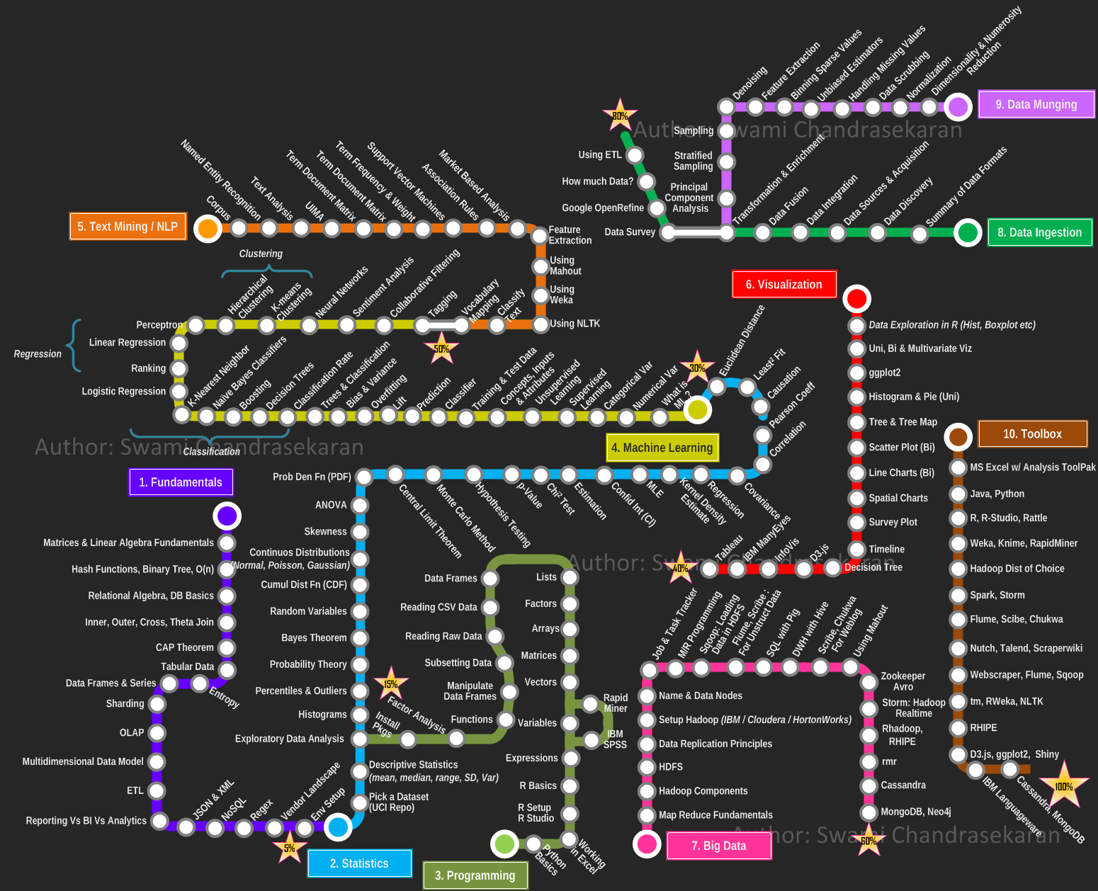
Given how critical visualization is for data science, ironically I was not able to find (except for a few), pragmatic and yet visual representation of what it takes to become a data scientist. So here is my modest attempt at creating a curriculum, a learning plan that one can use in this becoming a data scientist journey. I took inspiration from the metro maps and used it to depict the learning path. I organized the overall plan progressively into the following areas / domains,
- Fundamentals
- Statistics
- Programming
- Machine Learning
- Text Mining / Natural Language Processing
- Data Visualization
- Big Data
- Data Ingestion
- Data Munging
- Toolbox
Each area / domain is represented as a "metro line", with the stations depicting the topics you must learn / master / understand in a progressive fashion. The idea is you pick a line, catch a train and go thru all the stations (topics) till you reach the final destination (or) switch to the next line. I have progressively marked each station (line) 1 thru 10 to indicate the order in which you travel. You can use this as an individual learning plan to identify the areas you most want to develop and the acquire skills. By no means this is the end; but a solid start. Feel free to leave your comments and constructive feedback.
PS: I did not want to impose the use of any commercial tools in this plan. I have based this plan on tools/libraries available as open source for the most part. If you have access to a commercial software such as IBM SPSS or SAS Enterprise Miner, by all means go for it. The plan still holds good.
PS: I originally wanted to create an interactive visualization using D3.js or InfoVis. But wanted to get this out quickly. Maybe I will do an interactive map in the next iteration.