Google Track

Showing posts with label science. Show all posts

Saturday, January 9, 2016

Treehouse courses


Learning with Treehouse for only 30 minutes a day can teach you the skills needed to land the job that you’ve been dreaming about.

I can honestly say that besides technical knowledge, Treehouse also gave me a certain mindset, and while I generally am a very ambitious person, with each completed course I felt energized to better myself even more.



Is there any advice you’d like to share with new students who are aspiring developers?

I’ve been only for about 2+ years in this industry and I could already write tens of pages about what should and should not be done by aspiring developers, but here’s a few:

If you’re offered a project you know nothing about, take it, you’ll learn after.
Be passionate about it. If your brain doesn’t get “turned on” by new concepts, libraries, programming languages, you should not be doing it.
Get ready to learn continuously. The web is like the Universe. Ever expanding. Consequently the same has to happen to your knowledge and skill-set.
Teach others and code forward ( code forward is a concept I came up with and it comes from “pay it forward”; it basically means do a few projects for free once in a while for people who deserve it ).
Accept failure as a necessary step in self-betterment.
Research before asking questions and know when to ask. Putting in even hours or days for finding the solution will always be more rewarding in the long-run than asking a question on StackOverflow waiting to be spoon-fed the answer. That being said, asking has its place especially in a team-based environment or if the deadlines are (as they often are) very tight.
Go to as many interviews as you can. If you tell a recruiter (agent) that you’d like to go to the interview even if just for the sake of the experience, they’ll respect you for that, and will do their best to land you an interview. That being said, don’t just rely on recruitment agencies, show some initiative and contact companies on your own too. It might just be the detail that gets you hired.
Finally, keep learning, especially when you feel discouraged.


Sunday, March 23, 2014

MH370 flight mystery may have an answer


Data Science perspective: MH370 flight data are crucial

It has been a while and still no answer for the missing airplane of flight MH370. This case may give many possibilities, so guessing by trying each of them is painful and may lead to wrong directions, time consuming and frustrations. So simulating both physical and mathematical model maybe an answer

Mathematical Model

Data Science is newly established profession to solve problems with data insights in high volume of data, so in this case like airplane information systems, weather condition, pattern recognition, path selections etc.
Based in the data above, Data Scientists like me can build specific models to adapt exact or similar scenarios of the missing plane in the line MH370
This may give as good picture what may happen to flight, where may landed, what weather condition we had on that time, what other circumstances occurred and what impact they had over the plane.


Picture: Possible routes

If Malaysian Airport can provide with specific technical information about MH370 airplane, historical data of all MH370 flights, we may find important patterns to solve this mystery. Period between departure and lost signal may give us the distance compared to average distance of all MH370 flights on the same period. Adding weather condition may help us to segments the other MH370 flights that had same weather condition to seek specific scenarios under same weather condition. Route lines are similar to all flights in the same airline, but segmenting them to specific conditions of the missing flight like weather, airplane type, technical conditions, air pressure etc… may lead us to better targets. Technical check before departure may give us information of what have been checked or not and if there is room for possible technical failure. If there is room for failures, we can use data from all technical failure plan crashes to predict the time occurred the failure by that distance also segmented to adapt most the missing flight model.
Big Data technology provides us with the power to analyze big and complicated data sets, and there are plenty of professionals to do so.

Physical model- Simulation

I am not the expert of the field but it can be very smart to build a flight simulation of MH370 based on the mathematical model that we provided here and including other external data that have impact on the fight itself. Sometimes visualization may bring in table other factors that may be decisive in solving the mystery.
These represent alternative approaches to what may help involved institutions to solve this case and I hope they may consider these.

Thursday, October 31, 2013

Your Data Analysis Takes How Long?

Reference: www.biblogg.no

andycotgreave


Andy Cotgreave, Social Content Manager at Tableau Software, looks at how analytics tools can help to save valuable time

Imagine, for a moment, that you’ve been given a task to analyse a dataset inside sixty minutes and share your results. How far do you think you would get in that time?
It’s a question I had cause to reflect on recently, after running «Fanalytics», a workshop for users of Tableau Public. In the workshop, we gave people a dataset and one hour to do something cool. Their results were astounding.
To understand why they were so impressive, let me provide a little context by considering how many of us work with data.
First, let me dispel a myth. Contrary to popular opinion, if you are using spreadsheets or traditional BI tools, it is quite possible to build beautiful charts. Unfortunately, each view of your data takes considerable time to build, Do you have that time to spare in your working life? What if the chart you take 10 minutes to build doesn’t answer your question? What if it inspires a new question? You have to go back and start again.
What if you could explore your data at the speed of thought instead? What if each mouse click changed the view instantly? This is what we call visual analytics: it allows you to find insight in your data at speeds unimaginable just a few years ago.
You’re probably wondering how all of this relates to the Fanalytics competition I mentioned earlier. Well, during the session, we gave our teams a list of every UK Number one album since 1956, downloaded from Wikipedia. The instructions they were given were to analyse the data and publish something interesting within one hour.
Did they deliver? Oh, boy, yes, and in ways that made my jaw drop. Each entry was different. The winning team analysed albums that had been to number one more than once, revealing perennially popular music, and the effects of sales on a musician’s death. Another team came up with an album explorer that found out which album was number one on your birthday. One team created a visually gorgeous dashboard, sure to engage anyone. A further team came up with a predictive model based around the likelihood of any album title to get to number one. You can see all the entrants on Tableau’s Fanalytics blog post. What was truly amazing was that they did this in one hour. Sixty minutes!
Unfortunately, many people are stuck with tools that are cumbersome or too hard to use. It often takes more than an hour just to connect to data. The simple lesson I’ve learnt from the recent session is that although some tools can make amazing charts, they are often unnecessarily complicated. With some, you need to fill in five steps in a property wizard just to draw a chart. In others, you are required to write custom scripts before you can start drawing anything.
The question we need to ask is whether we are using the right tools to answer questions quickly and in the most efficient way? If not, then perhaps it’s time to ditch these time hogs and focus on analytic tools that save you time instead!

Tuesday, September 17, 2013

The Data Science Mindset

Intro 

Names like ‘R’, ‘SQL’, and ‘D3’ make data science seem more like alphabet soup than a deliberate practice of working with data. It’s so easy to get lost in the sea of acronyms, packages, and frameworks that we often find our students prematurely optimizing for the right toolset to use, unable to move forward until they have researched every available option. In reality, data science isn’t just about the tools. It’s a mindset: a way of looking at the world. It’s about taking advantage of our modern computers and all of the information that they’re already collecting to study how things work and push the limits of human knowledge just a little bit further. We have a favorite saying around here — data is everything and everything is data. If we begin with this mindset, a lot of data science approaches naturally follow.
 

Store Everything

Storage is cheap. Collect everything and ask questions later. Store it in the rawest form that is convenient, and don’t worry about how or even when you’re going to analyze it. That part comes later.

Use Existing Data

We’re already storing data — let’s use it. When faced with questions, data scientists regularly adapt the query so that it can be approximately answered with an existing and convenient dataset. The best part of data science is discovering surprising applications of existing stores of data. For example, there is a plethora of satellite imagery of Earth. We can use this data to learn about fertilizer use in Uganda, or use pictures of the Earth at night to estimate rural electrification in developing countries.

Connect Datasets

We’re storing everything, all over the world, inexpensively, for the first time in history. There are many lessons to be learned by utilizing more of this treasure trove. Don’t worry about making the best use out of a single source of data. Focus on connecting disparate datasets rather than tuning your models. Conventional statistics teaches a lot about how to choose analysis methods that are appropriate for your data collection approach and how to tune the models for a specific dataset.
Effective data science is about using a range of datasets, connecting the dots between one set of data and another, such as predicting restaurant health scores based on Yelp reviews. In machine learning speak: it’s often better to collect more features rather than spend days optimizing hyperparameters.

Anything Can Be Quantified

Our culture loves to quantify. If you can turn it into a number, that number can be put into a table. Importantly, that table can now be processed by a computer.
A spreadsheet about sewer overflows is clearly data to most people, but what about a calendar? At first, a calendar might not seem like the sort of data that you analyze with statistics. However, you can also represent a calendar as a spreadsheet and as a graph.


Data science becomes a creative endeavor when peeling away the obvious variables presented to you. Maybe you have a bunch of PDF documents. You could easily extract the text in the PDFs and search through the content. Depending on the problem you are solving, these files hold more interesting information than just the text. You can get the page count, the file size, and the shapes of the pages and the program that created it. There is information hidden in many datasets that goes beyond what’s immediately obvious.
There is a lot of talk about the difference between different kinds of data. There’s “qualitative” vs. “quantitative” and “unstructured” vs. “structured.” To me, there isn’t much difference between “qualitative” and “quantitative” data, nor is there between “unstructured” and “structured” data because I know that I can convert between the different types.
At first, the registration papers of company might not seem like interesting data. They begin as paper, most of the fields are text, and the formats aren’t particularly standardized. But when you put them in a database in a machine-readable format, qualitative data becomes quantitative data that can be used to supplement other data sources.

Send Boring Work to Robots

We no longer live in an era where “computer” refers to someone who carries out calculations. Find yourself doing something over and over? Give it to the bots. As far as data analysis goes, modern computers can be far more effective at rote tasks, such as drawing new graphs with every update of a dataset.
Data collection is a prime example of a task that should be automated. A common scene in university research labs is swaths of grad students handing out paper questionnaires to participants of studies. The data scientist says: collect the data automatically and unobtrusively, using existing systems whenever possible. The supercomputers we carry in our pocket are a great place to start.
This mindset can be applied not only to the data, but also to the process itself. Rather than learning and remembering your entire analysis process, you can write a program that does the whole thing for you, from the original acquisition of the data, to the modeling, to the presentation of results to another person. By making everything a program, you make it easier to find mistakes, to update your analyses, and reproduce your results.

Tools

Once inside the data science mindset, solving interesting problems becomes a function of data acquisition and processing. Computers can fit models and make predictions about datasets that are too big to wrap your head around and convert paper documents into electronic tables. They probably know more about you and your habits than you know yourself! Use the tools available to you, but don’t get caught up on the tools themselves.
Properly discussing these relevant tools is another post (maybe a book), but here’s one thought. While it always helps to have more education, you don’t need a PhD in math or computer science in order to create useful things. Loads of wonderful algorithms have already been implemented for you, and simple algorithms often work quite well. If you’re just getting started, focus on the “plumbing” that connects different datasets and systems together.

Data Science Mindset at Zipfian Academy

Our course teaches many data science tools, but we also teach the data science mindset, because you need both to be a great data scientist. To this end, we organize our 12-week course by projects — such as a recommendation engine or spam filter — rather than software packages or algorithms. We teach the various tools in context of applied projects so students learn how to choose the appropriate tool and how to build the plumbing that connects them.
In the end, it’s not about the newest, trendiest framework or fastest data analysis platform. It’s about finding interesting insights from your data and sharing it with the world. Start small, get your hands dirty, and have fun!

Wednesday, July 17, 2013

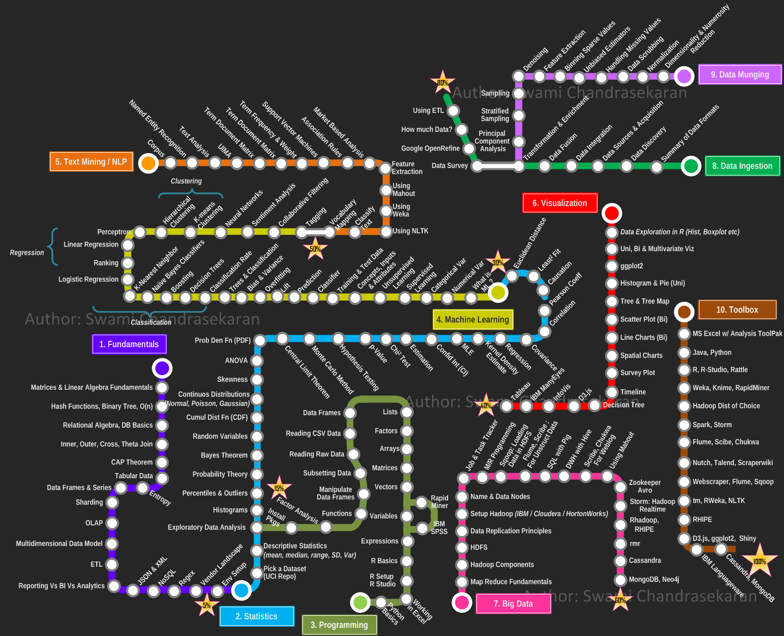
Becoming a Data Scientist – Curriculum via Metromap

by Swami Chandrasekaran

Data Science, Machine Learning, Big Data Analytics, Cognitive Computing .... well all of us have been avalanched with articles, skills demand info graph's and point of views on these topics (yawn!). One thing is for sure; you cannot become a data scientist overnight. Its a journey, for sure a challenging one. But how do you go about becoming one? Where to start? When do you start seeing light at the end of the tunnel? What is the learning roadmap? What tools and techniques do I need to know? How will you know when you have achieved your goal?
Given how critical visualization is for data science, ironically I was not able to find (except for a few), pragmatic and yet visual representation of what it takes to become a data scientist. So here is my modest attempt at creating a curriculum, a learning plan that one can use in this becoming a data scientist journey. I took inspiration from the metro maps and used it to depict the learning path. I organized the overall plan progressively into the following areas / domains,
  1. Fundamentals
  2. Statistics
  3. Programming
  4. Machine Learning
  5. Text Mining / Natural Language Processing
  6. Data Visualization
  7. Big Data
  8. Data Ingestion
  9. Data Munging
  10. Toolbox
Each area  / domain is represented as a "metro line", with the stations depicting the topics you must learn / master / understand in a progressive fashion. The idea is you pick a line, catch a train and go thru all the stations (topics) till you reach the final destination (or) switch to the next line. I have progressively marked each station (line) 1 thru 10 to indicate the order in which you travel. You can use this as an individual learning plan to identify the areas you most want to develop and the acquire skills. By no means this is the end; but a solid start. Feel free to leave your comments and constructive feedback.
PS: I did not want to impose the use of any commercial tools in this plan. I have based this plan on tools/libraries available as open source for the most part. If you have access to a commercial software such as IBM SPSS or SAS Enterprise Miner, by all means go for it. The plan still holds good.
PS: I originally wanted to create an interactive visualization using D3.js or InfoVis. But wanted to get this out quickly. Maybe I will do an interactive map in the next iteration.